
Brad Frost, Web Designer – UNIQUEWAYS podcast
I appeared on the UNIQUEWAYS podcast with Thomas Girard, an interesting show where the guests are all asked the same set of questions. It was fun!
I appeared on the UNIQUEWAYS podcast with Thomas Girard, an interesting show where the guests are all asked the same set of questions. It was fun!
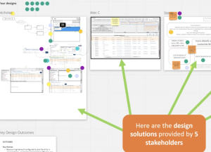
We often spotlight wireframes, research, or tools like Figma, but none of that moves the needle if we can’t collaborate well. Great UX doesn’t happen in isolation. It takes conversations with engineers, alignment with product, sales, and other stakeholders, as well as the ability to listen, adapt, and co-create. That’s where design becomes a team sport, and when your ability to capture the outcomes multiplies the UX impact.
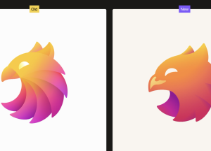
Over the last six months, we’ve been quietly at work on a new logo, which you’ll now see more or less everywhere we are. Perhaps unusually for a bank, we’re extremely passionate about design—and wanted to lift the hood a bit to share the process behind the redesign.
After years of rapid innovation, now feels like the right time for browser vendors to take a beat to consolidate, fix browser inconsistencies, and let the rest of us catch up.
Summary: Improve AI-enhanced workshops by narrowing ideas with clear criteria, allowing time to prompt, encouraging collaboration, and documenting results.
Each minute, millions of teens scroll through videos on social media platforms. These platforms are designed to connect people, but their overuse among young users is leading to serious, unintended consequences.
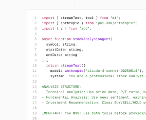
AI agents are software systems that take over tasks made up of manual, multi-step processes. These often require context, judgment, and adaptation, making them difficult to automate with simple rule-based code.
Have you ever switched to dark mode on your phone late at night and felt instant relief as your eyes relaxed? You’re definitely not alone! Dark mode featuring dark backgrounds paired with lighter text isn’t just trendy; it’s become a favorite setting for millions of users worldwide. But while it’s great for aesthetics and comfort, it’s equally crucial to design dark modes that are genuinely accessible to everyone.
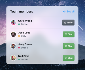
Get started with this free CSS generator based on the glassmorphism design specifications to quickly design and customize the style properties.
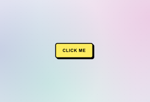
Create bold, eye-catching buttons with the distinctive neobrutalism design style featuring thick borders, vibrant colors, and prominent shadows.


