
Microsoft to stop selling Windows 10 downloads on January 31st
Microsoft says it will stop selling downloads for Windows 10 Home and Pro licenses later this month. Windows 10 will continue to be supported until October 2025.
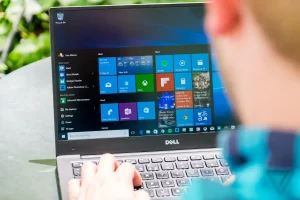
Microsoft says it will stop selling downloads for Windows 10 Home and Pro licenses later this month. Windows 10 will continue to be supported until October 2025.

Landing a UX designer job requires a lot of hard work. Not only do you need a lot of preparation to get invited to the interview, but you also need to convince hiring managers that you’re the best candidate for this position. While it’s impossible to know beforehand what questions the interviewer will ask you, a few common questions come up frequently during UX designer interviews. This article will share…

Apple likes to portray its Macs as the best, most innovative computers in the world, so it can be easy to forget that the company has released some real stinkers over the years. Not every Apple computer has been a hit — some have been downright awful.

Whether you’re a designer, developer, or simply curious about user interface and user experience design, these channels offer a wealth of knowledge and inspiration. From tutorials and case studies to critiques and design trends, you’ll find a wealth of information to help you improve your skills and stay up-to-date with the latest industry developments. So without further ado, let’s dive into my top 10 picks!
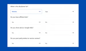
A disclaimer generator tool is a great tool for website and app owners, as it allows them to easily create a disclaimer for their website or app. This is especially important for website and app owners.
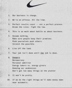
Is a modern office really an office without inspirational quotes scrawled across the walls, on the stairway and in meeting rooms? These days, such quotes are part and parcel of office life, though it’s hard to know whether anyone ever does actually feel inspired by said maxims. We bet the ones in your office don’t quite stick in the mind as much as those in an old internal memo from…

Vivianne Castillo argues that a designer’s relationship to hope has an outsized impact on their values, research, and practice.
This UX designer learned the hard way, but you don’t have to.
Google now has plans to step up its introduction of AI products in the wake of highly popular technology competition, such as the AI chatbot ChatGPT developed by OpenAI, according to The New York Times.
That the company promotes certain videos, sometimes to enhance relationships with creators and businesses, is no longer just an open secret.


