Latest stories

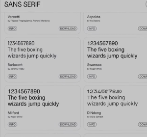
15 Best New Fonts for November 2022

This month, a distinctly medieval aesthetic permeates some of the designs. You’ll find plenty of rebellion in fonts that break the rules for fun. And as always, we’ve included some excellent practical options. Enjoy!

Kive.AI – A multiplayer AI creation canvas

Start a new collaborative AI canvas or join thousands of other creatives in shared rooms.

Do your icons mean what you think they mean?

We take for granted that most users are familiar with common icons, such as a cog meaning settings, or a bell meaning notifications. However, the chances are that we’re going to need to make some custom icons that are specific to our industry or product, and we can’t expect a user to immediately recognise what they mean.

8 Tips to Become a Better Product Designer

Being a product designer is kind of like being a jack of all trades — you are expected to do a variety of things and sometimes it’s even hard to jot down what skills you should be focusing on. If you’re thinking about that and how you can improve yourself you’re already making progress. No one is perfect, we should all strive to learn and improve our skills.

UX Design Job Interview Tips for Global Candidates: Landing Your Dream Role in the US

Searching for a design job is never easy—and it’s even more challenging if you’re new to the country and culture you want to work in. Here are steps one designer took to build a successful design career in America.

Why designers keep trying to kill the logo

“Logomania is over,” declared Teo Van den Broeke, British GQ’s style and grooming director, in the Financial Times earlier last month. He was referring to the unfortunate fashion world trend of plastering every square inch of articles of clothing with designer logos, and sugges

CSS Animated Grid Layouts

In CSS Grid, the grid-template-columns and grid-template-rows properties allow you to define line names and track sizing of grid columns and rows, respectively. Supporting interpolation for these properties allows grid layouts to smoothly transition between states, instead of snapping at the halfway point of an animation or transition.

Where to put the primary button?

Where do you place the primary button in a button group? left? right? When does it go fluid? When does it stack on top? There is no right or wrong answer to this. It is more about making a call and sticking to it. Having worked in multiple large-scale design systems, this is my take.

What is Design Simplicity and How to Achieve it?

Design simplicity is a term companies use without truly understanding its meaning. As discussed in this article, simpler isn’t always better, and how designers apply simplicity can have positive and negative effects.

Pushing visual and interactive expression in design guidelines with Material Design 3

Pushing visual and interactive expression in design guidelines with Material Design 3

1 2 369 370 371 372 373 374

Submit an article

You can submit new articles related to web design / development, UX, apps and graphic design. No homepage submissions, no spammy affiliate links will be accepted.
Title
URL

Thank you!

Thanks for submitting your story. We will review it and approve it if relevant.