I Have Nothing but respect for Whitney Houston’s new branding
This visual identity is sleek yet playful.
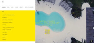
A beautiful design with an amazing background video animation on scroll. Our pick this week.
Designers are often trying to personalise experiences. However, can too much personalization lead to side effects? Can it lead to behaviour change?
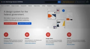
Building a design system is expensive. Whether an organization develops from scratch or adopts an open-source design system, theming is crucial for customization. This customization could be as simple as creating a dark mode or a multi-brand design system to accommodate a product suite.
Simple rules that will help you design a streamlined first-time users experience
Unsure how to design and implement user-interface patterns? Use this collection of links to our content about specific patterns.
Apple Business Connect makes it easy for customers to find businesses using Apple Maps. Create a place card that is accessible to everyone who uses Apple devices and built-in apps — with directions, contact information, and actions built right in.
Learn how one of the world’s best known logos originated, and how it’s evolved over the years.
Darkroom is known for its modern, Apple Design Award-winning design, and its app icon is no exception. We thought it would be interesting to gain an inside look from Jasper Hauser, the co-founder and designer behind Darkroom, on the how and why he designs Darkroom’s app icons.
Brainstorming typically requires a presence of a facilitator, someone who sets ground rules such as no criticism of ideas and leads the brainstorming session to keep the discussion on track and ensure everyone has a chance to contribute.