New roles, new rules
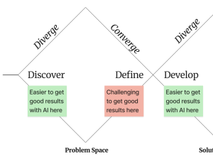
With faster iteration cycles and AI tools helping people stretch further up the stack, more product builders are reinventing their roles.
With faster iteration cycles and AI tools helping people stretch further up the stack, more product builders are reinventing their roles.
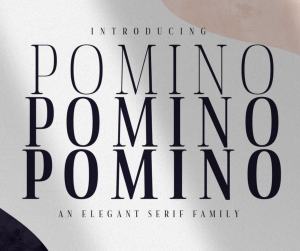
It’s time to delve into a collection of the best beautiful, modern serif fonts. Serif fonts are ideal for printed literature, detailed typography, or for creating a more formal effect. And these popular serif fonts really stand out from the crowd.
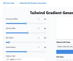
This tool is a fantastic all-rounder and my personal starting point for many projects. What sets it apart is its intuitive multi-layer support. You can stack several shadow layers, each with its own offset, blur, spread, and color, which is the secret to creating incredibly soft and realistic depth. It’s perfect for mimicking the subtle shadows you see in high-end dashboards and component libraries.
With Molly joining Shopify, design takes center stage in shaping the future of AI and commerce.
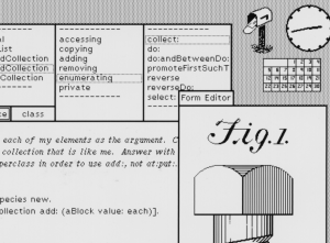
Design tokens may be the latest incarnation, but software creators have been creating themeable user interfaces for quite a long time! As with all things, we can study history to learn from our past to inform our future. So let’s dig in!
The idea behind this is to share a full, unfiltered look at integrating CSS Cascade Layers into an existing legacy codebase. In practice, it’s about refactoring existing CSS to use cascade layers without breaking anything.
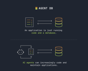
With every new technology platform, the concept of an application shifts. Consider the difference between compiled apps during the PC era, online applications during the Web, and app stores during mobile. Now with AI it’s happening again.
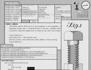
Design tokens may be the latest incarnation, but software creators have been creating themeable user interfaces for quite a long time! As with all things, we can study history to learn from our past to inform our future. So let’s dig in!
For a design system program where the goal is often stable, high quality, durable output, how much instability, lack of quality, or impermanence can we tolerate in our tools? That’s the question Nathan Curtis and I asked the design system community for Episode 060 of The Question.

I know estimates have a bad reputation. Most engineers hear “estimate” and immediately think of micromanagement, unrealistic deadlines, and that manager who asks “is it done yet?” every few hours. I’ve seen teams reflexively pad their numbers by 3x just to avoid the inevitable disappointment when reality doesn’t match the plan.