Why every designer needs a design inspiration library
A design inspiration library is a lifelong practice; one that helps you anchor new projects, spark original ideas, and refine the taste and discernment that define great designers.
A design inspiration library is a lifelong practice; one that helps you anchor new projects, spark original ideas, and refine the taste and discernment that define great designers.
Each week, I’ll send you a short, friendly roundup of the most useful tools, ideas, and real-world examples—curated specifically for developers like you. No hype. No fluff. Just insights you actually need to stay ahead.
Welcome to Fundament, a weekly product design newsletter where we share actionable tips and insightful stories with the worldwide design community. Join 2,200+ readers and grow as a UX and product designer with us!
The closer an investment is to a core economic driver (revenue or cost), and the shorter the feedback loop between action and outcome, the easier it is to understand, justify, and manage ROI.
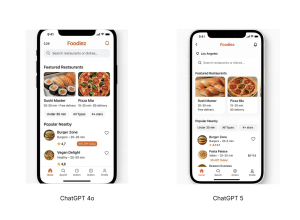
Generative UI is evolving at lightning speed, and nowadays we can achieve impressive results simply by asking AI tools to generate UIs for us. And the great thing is that you don’t need to switch from ChatGPT to any other tool to generate UI.
Journey mapping is one of the most widely used tools in interactive design, helping us create products and campaigns that connect with users on a deeper emotional level. This is key to building long-term loyalty, where users and customers feel an irrational sense of trust and gratitude toward your brand.
iOS 26’s visual language obscures content instead of letting it take the spotlight. New (but not always better) design patterns replace established conventions.
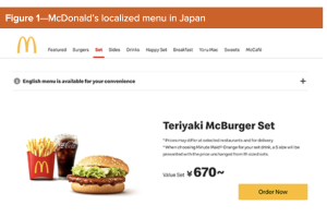
Cultural proximity refers to the degree of similarity in cultural traits, practices, values, language, and norms between groups, countries, or regions. People tend to trust and collaborate more easily with others who share similar backgrounds. This shapes our decision-making and sense of trust when we interact with others; however, it also potentially introduces bias and limits diversity. In this column, I’ll explore the benefits and challenges of leveraging cultural proximity, how…
Maybe you’ve gotten comfortable writing prompts or using simple one-click tools. But as AI interfaces start to take different forms, many of them are still kinda hard to figure out. Navigating them can be overwhelming. It doesn’t feel like you’re using these products so much as deciphering them. The engineering is powerful, but the flows don’t make sense.
Ever Google “UI UX design blogs” hoping to stumble upon designer secrets—not just recycled lists? It’s tough. Most search results feel stuck in 2022, spotlighting the same names and missing the dramatic leaps in AI, accessibility, and workflow seen in 2025. If you’re a designer who wants more than surface-level tips, this list is crafted to deliver real value: tested resources, practical advice, and workflow gems tailored for UI/UX professionals at every…