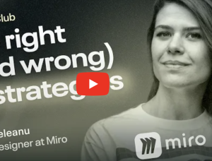
Skeleton Loading: Boost UX with Placeholder Magic
Ever noticed those gray, shimmering boxes that appear while a webpage loads? Those are skeleton loaders— a powerful UX technique that makes waiting feel faster.
These templates allow you to create a professional hero photo by combining various static elements, such as backgrounds, objects, and text, to make any photorealistic design presentation your project requires. And doing all of this in Photoshop couldn’t be easier.
Remember that last team brainstorming session where you were supposed to generate a long list of brilliant ideas? How many of those ideas actually stuck? Did leadership act on any of those ideas? In this article, Eric Olive challenges the value of exercises like brainstorming and explores more effective methods for sparking creativity to improve design and enhance the user’s experience.
Meta’s Chief Technology Officer on consciousness, questioning design paradigms, and building for the future.
Themes can be free or premium, and some developers even choose to create a custom WordPress theme for your site to match the unique branding and functionality of a business. Custom themes offer flexibility and allow developers to integrate features that might not be available in pre-built options.
Artificial Intelligence (AI) is making significant progress in healthcare, changing the way medical professionals diagnose diseases, plan treatments, and deliver patient care. As AI technologies mature, they are helping healthcare providers and businesses address long-standing challenges, improve efficiency, and offer better outcomes for patients. This blog explores how AI is influencing healthcare, with a focus on diagnosis, treatment, and patient care excellence. It also highlights practical applications and benefits for…
The Duolingo CEO recently compared the AI shift to the mobile-first revolution.
The way we access the internet has changed dramatically. No longer are desktops the primary access point; mobile devices now dominate, and tablets occupy a significant middle ground. This shift necessitates a fundamental change in how we design websites. A one-size-fits-all, fixed-width design is no longer sufficient. Instead, responsive web design has become essential. This article provides data-driven recommendations for optimal website design widths and breakpoints in 2025, to help…
GSAP’s premium plugins are now free, and this article explores their creative potential through five playful animation demos.
I had the pleasure of speaking with Vy Alechnavicius on the Experienced Design podcast. We had a great wide-ranging conversation!