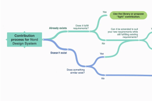
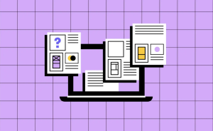
Design System Contribution Models
Contribution models allow product teams to add new features to existing designs based on their product requirements without breaking the quality of existing designs.
Contribution models allow product teams to add new features to existing designs based on their product requirements without breaking the quality of existing designs.
A deep dive into the creative process, challenges, and design principles behind Webflow’s new iconography.
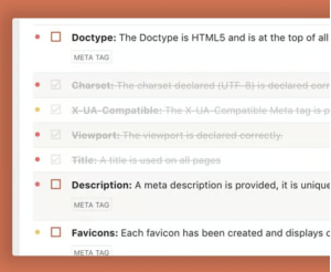
UX debt refers to known user experience issues that have not yet been fixed. These unresolved UX issues lead to inconsistent and ineffective user interactions that lead, in turn, to business loss.
There are so many good things happening with website design right now. From simplification of style and brand to creating warmth with color to finding ways to incorporate motion throughout a design without feeling obtrusive, we love the concepts that designers are playing with.

As adoption of generative AI (GenAI) continues to grow, adversarial interest in compromising the security posture of all applications and services — whether they leverage GenAI or not — is increasing as well. Companies that develop and deliver the complex software on which so much of the world’s economy depends must focus their efforts on defending against these attacks.
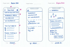
In the world of digital product design, a seamless design handoff is crucial for ensuring that the vision crafted by designers is accurately brought to life by developers. Yet, this phase can often be fraught with miscommunication, inconsistencies, and inefficiencies.
Free tools are essential for any web developer’s toolkit, especially for those on a budget or looking to enhance their skills without incurring costs. These tools help developers save money while providing access to critical features and resources that boost productivity and creativity.
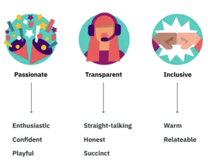
Choosing the tone of voice for a digital product’s copy is crucial to creating a consistent and engaging user experience. Product teams come in all shapes and forms, but they often don’t have a dedicated UX writer. As a result, writing the UI texts might happen on the fly, and the final result does not always support users best.
Investing in UX design is often seen as an afterthought in many businesses. It’s a common misconception that UX is a luxury rather than a necessity.
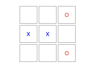
Tic-tac-toe is a popular two-player game that uses a 3×3 grid. The players use the symbols X and 0, and try to get three symbols in a row to win the game. Let’s build one with JavaScript!