
Stop shipping “friendly” AI copy
You can ship a lot of “smart” UI this year while quietly making it less trustworthy, less coherent, and harder to operate.

You can ship a lot of “smart” UI this year while quietly making it less trustworthy, less coherent, and harder to operate.
Working solo is one of the benefits of being a freelance web designer. You don’t have a boss breathing down your neck or tracking every mouse click. That’s one reason why many of us choose this career path.
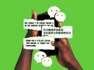
Amid Donald Trump’s intensifying immigration raids, Documented NYC uses platforms like WhatsApp, WeChat, and Nextdoor to connect directly with immigrants.
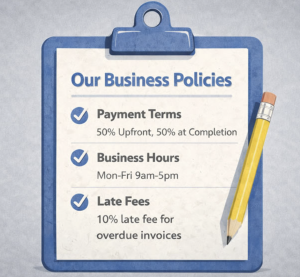
Good UX is what companies do when they have to. A company that has your stuff locked away doesn’t have to.

Developers use Chrome DevTools almost every day, but the toolset is so extensive that many features remain unnoticed. In this short overview, we’ll explore several DevTools capabilities that are genuinely useful in real-world work and often overlooked.

SaaS UX is moving faster than most product teams realize. What felt modern in 2024 already feels slow, clunky, or confusing today. Users now expect software to understand them, guide them, and get out of the way.
When I joined Google ~14 years ago, I thought the job was about writing great code. I was partly right. But the longer I’ve stayed, the more I’ve realized that the engineers who thrive aren’t necessarily the best programmers – they’re the ones who’ve figured out how to navigate everything around the code: the people, the politics, the alignment, the ambiguity.

Built into the Claude Desktop app, the new tool lets users designate a specific folder where Claude can read or modify files, with further instructions given through the standard chat interface. The result is similar to a sandboxed instance of Claude Code, but requires far less technical savvy to set up.

For portfolios of assets, we use the terms liquidity and fungibility to describe how easily assets can be converted into cash without materially affecting their price, and how easily investments can be exchanged for one another or rebalanced across the portfolio.
We’ve all heard the promises. Empowered teams make better products. They’re more engaged, more innovative, and they ship faster. According to Marty Cagan’s definition in his book Empowered, truly empowered product teams are “given problems to solve rather than features to build” and have “the authority to decide the best way to solve those problems.” They’re accountable for outcomes, not outputs.


