Latest stories

Material You’s new progress bar design asks you to mind the gap

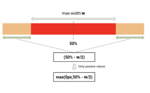
Besides Dynamic Color support and the “new motion behavior,” there’s also now “higher contrast between track and active indicator to enhance the perception of progress.” These Material You progress bars also add an “end stop indicator to improve accessibility”:

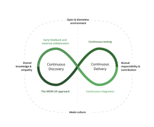
The Diagram that Shows the Value of Great UX

One of the questions I get an awful lot these days is, “How do we show that a great experience produces immense value for the organization?”

10 Best Websites for Free HTML Templates Vanilla CSS

This is a curated roundup of the best websites where you can download HTML templates for free. More specifically vanilla CSS templates that don’t rely on any frameworks.

DesignerNews.co – It’s been a great run!

Designer News is transforming and joining the We Work Remotely family. Soon Designer News will no longer be available but we have great news, with the power of We Work Remotely, we’ll still help you find and list the best remote jobs.

10+ Inspiring Web Design Blogs to Follow in 2024

In this post, we highlight the most inspiring and useful web design blogs you should follow this year.

Case Study: Physica Magazine. Website Design and Graphics for Scientific Blog

Our new case study unveils the project made at the crossroads of art and science: welcome to take a look at the creative process and solutions for Physica Magazine, the scientific blog wrapped in artistic, eye-catching, and functional web design by the tubik agency team.

Making CSS View Transitions Easy with Velvette

Learn how to effortlessly implement smooth CSS view-transitions with Velvette, a useful library designed to tackle common challenges and enhance user experiences in web applications.

Adobe Firefly is doing generative AI differently and it may even be good for you

Using your own Stock

AI Art is the new stock image

AI images are quick and easy to make. They look great at first sight, and they quickly replaced the use of stock images. But, like everything cheap and easy, they come with trade-offs. A short critique of the pure AI image.

Banco Itaú – Brand identity redesign for Brazil’s biggest bank.

To create a new proprietary shape, Pentagram and Itaú’s in-house design team pushed beyond the square, increasing the radius of the corner curves and rounding out the sides to make the form more organic and dynamic.

1 2 116 117 118 119 120 380 381

Submit an article

You can submit new articles related to web design / development, UX, apps and graphic design. No homepage submissions, no spammy affiliate links will be accepted.
Title
URL

Thank you!

Thanks for submitting your story. We will review it and approve it if relevant.