Latest stories

From Intern to Senior. Part 1: Strategic thinking, engagements, and definition of design

Mature organizations use career ladders to assess whether an employee is exceeding their job expectations and ready for promotion. These ladders typically encompass several areas of skills and provide a precise indication of whether someone is close to being promoted or if they should focus on improving in certain areas.

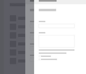
Enhancing Data Input with Layered Drawer Navigation

In our original design, user input was handled through modal dialogs. This approach became problematic as our workflows grew in complexity — especially when forms became multi-step, or when nested actions required opening a new modal on top of another.

Creating proportional, equal-height image rows with CSS

Equal-height image layouts seem simple until you try to build one that’s truly responsive. This tutorial walks through my solution using flexbox aspect ratios, the Eleventy Image plugin, and a Nunjucks shortcode.

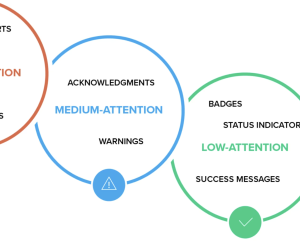
Design Guidelines For Better Notifications UX

As always in design, timing matters, and so do timely notifications. Let’s explore how we might improve the notifications UX. More design patterns in our Smart Interface Design Patterns, a friendly video course on UX and design patterns by Vitaly — from complex data tables and nested filters to FAQs and error messages.

Exploring CSS’ new “if conditions”

Discover how to use CSS @if() conditions to streamline your styles—no preprocessors needed!

How 10 years of UX innovation digitally transformed Transport Focus into the UK’s go-to transport resource

When Transport Focus first approached us in 2012, we could never have predicted that a decade later, we’d be stewarding one of the UK’s most critical public resources through its third major evolution. What started as a straightforward website redesign has grown into a strategic partnership that demonstrates the power of sustained collaboration.

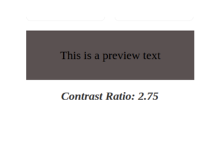
Create a color contrast checker with HTML, CSS, and JavaScript

In this tutorial, we’ll create a color contrast tool that lets you check the accessibility and readability of text, by comparing the ratio between background and foreground colors.

How to Create Reusable Canva Templates for Your Brand

Consistency is key when it comes to building a memorable brand. But keeping your designs aligned, especially when your team is growing or juggling lots of content, can be time-consuming.

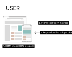
HTMX vs. React: Which is Better for Your Next Project? (2025)

Let’s be honest for a second. Have you ever set up a new front-end project and, somewhere between choosing a build tool, a state manager, and a styling library, just felt… tired? It’s a specific kind of exhaustion. You haven’t even written a line of app logic, but you’re already worn out by the sheer weight of the decisions.

Figma moves closer to its community with Latin American Spanish localization

Figma, a design and development platform for people who build apps, websites, and other digital products together, is expanding its presence in Latin America. At the same time, it is further localizing its products with the launch of Latin American Spanish.

1 2 3 482 483

Submit an article

You can submit new articles related to web design / development, UX, apps and graphic design. No homepage submissions, no spammy affiliate links will be accepted.
Title
URL

Thank you!

Thanks for submitting your story. We will review it and approve it if relevant.