
It’s hard to justify Tahoe icons
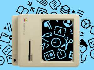
I was reading Macintosh Human Interface Guidelines from 1992 and found this nice illustration:
I was reading Macintosh Human Interface Guidelines from 1992 and found this nice illustration:
