UX stories

Varying Sizes of Radio Buttons

When I was looking at what looks like the “official” online personality test for Meyers-Briggs when I was spouting off about personality tests, I noticed that their radio button choices were actually kinda cool:

A Design System Coach’s Portfolio

The standard way that the tech industry typically evaluates whether someone knows their stuff is through the all-powerful Portfolio. There are many definitions of portfolio, but generally, it means “a collection of stuff.”

Why Google Chrome Copying Safari’s Bottom Search Bar Is Great News

In iOS 15, Apple moved mobile Safari’s address and search bar down from the top of the screen to sit right above the keyboard. Now, just two years later, Google has done the same. A bottom bar has one big advantage: it’s way easier to reach with a thumb when typing on your phone, either one- or two-handed. It’s also easier to read what you’re typing, as you don’t have…

Dark Mode: How Users Think About It and Issues to Avoid

Dark mode is popular, but not essential. Users like dark mode but maintain similar behaviors without it. They think about it at the system level, not the application level. If you choose to support dark mode, test your design to avoid common dark-mode issues.

Review Card — How to Design it

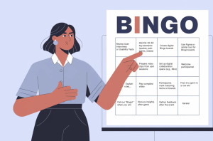
Review card is a design element that appears on websites and applications to highlight feedback about a product, service or experience. A review card displays user feedback in a compact, visual format on digital platforms. It’s a familiar UI pattern that presents a user’s evaluation—often accompanied by a rating, comments, and sometimes user-related information.

Accessible colours for your design system: A comprehensive guide

Within the following article, I venture into the intricate process of auditing and transforming a Design System’s colour palette, a journey that seeks to marry the qualities of harmony, accessibility, and consistency. This journey not only entailed rigorous testing but also embraced the utilisation of instrumental tools to forge a palette that seamlessly marries aesthetics with inclusivity.

Chrome’s sidebar apps are the best new productivity feature no one’s talking about

Get vertical tabs, ChatGPT shortcuts, searchable bookmarks, and more.

Microsoft Might Try and Stick AI Into MS Paint

The company is reportedly also considering adding AI capabilities to default Microsoft apps akin to what iOS and Android phones already have.

Dark Patterns vs. Nudging in UX Design

When it comes to UX design, there’s an ongoing clash between two opposing forces: dark patterns and nudging. Dark patterns cleverly trick users into certain actions, while nudging gently guides them towards desired outcomes that are good for society as a whole.

To test or not to test, a technical perspective

This article delves deeper into the creation of test cases from a technical perspective, detailing what should be included in each test and what to avoid. Essentially, you’ll learn the answer to the age-old questions of “What to test” or “What not to test”.

1 2 19 20 21 22 23 70 71

Submit an article

You can submit new articles related to web design / development, UX, apps and graphic design. No homepage submissions, no spammy affiliate links will be accepted.
Title
URL

Thank you!

Thanks for submitting your story. We will review it and approve it if relevant.