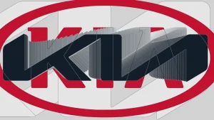
Why KIA’s confusing logo is part of a growing design trend
Kia has a logo problem: namely, that people can’t quite read it. The recent revelation that the company’s new logo causes 30,000 people a month to Google “KN car” sent the design world into a minor tizzy, resulting in a number of proposals to “fix” the logo by restoring the missing crossbar to its “A.” This unimaginative, too-literal approach

