UX stories

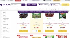
Grocery UX: Dynamically Update the “Add to Cart” Button

During Baymard’s large-scale grocery testing, as participants explored different food categories and added products to the cart, they would sometimes lose track of what they had already added to the cart. As a result, users in the product list will be forced to visit the cartagain and again in order to confirm items that have been added, adding significantly to the time it takes to complete the order, and introducing the…

The cult of productivity

Is the decline of elitism of creativity inevitable?

Redesign your System thinking

Research, design, build and release — a 4-part guide to create, document and maintain your design system components. As well as tips and tools to create the ultimate component library.

Rewriting Digital Content for Brevity

Writers always get the advice to be concise, but doing so is easier said than done. These tips and tricks help reduce your word count.

Usability Audit of the Zara Web Site

I’ll share my analysis of the Zara Web site, examining its functional capabilities and design features to better understand how the brand achieves ecommerce success and caters to the needs of modern consumers.

U.S. announces official web design system

The federal government now has its own design system, crafted to make government online servives accessible, legible and consistent.  

7 Important Visual Hierarchy Design Principles 2023

“Visual Hierarchy” is a core design principle that refers to how different elements are arranged in a design by order of relevance. The best product, website, or app interface designers manipulate the characteristics of different elements (colors, alignment, fonts, etc.) to give their designs engaging visual hierarchies.

100 days of UX gifs are a treasure trove of design delights

We speak to Tim Smith about his ‘gifolio’.

Google Fonts redesign is a neat example of Material 3 on mobile web

The Google Fonts website has been thoroughly updated with a Material 3 redesign that serves as an interesting showcase of the design language on mobile web.  

Designing Better Error Messages UX

When we design interfaces, we rarely think about error messagesfirst. But error messages can make or break the experience in situations when things go south. Let’s fix that. By Vitaly Friedman.

1 2 17 18 19 20 21 70 71

Submit an article

You can submit new articles related to web design / development, UX, apps and graphic design. No homepage submissions, no spammy affiliate links will be accepted.
Title
URL

Thank you!

Thanks for submitting your story. We will review it and approve it if relevant.